Frankenstein Variorum Reflection
I didn’t know about Variorum Viewer and the Shelley-Godwin Archive until recently, and for my latest project, I read five drafts of Frankenstein archived within it.
The website contains the manuscript, the 1818 edition, the 1823 edition, the Thomas edition, and the 1831 edition. Before I begin, it’s worth noting that the manuscript is not finished. Section 7 onwards has been published, but the previous sections have not been translated as of the time of writing this. I am also using the 1818 version as a base for my comparisons.
Frankenstein: Thomas Edition
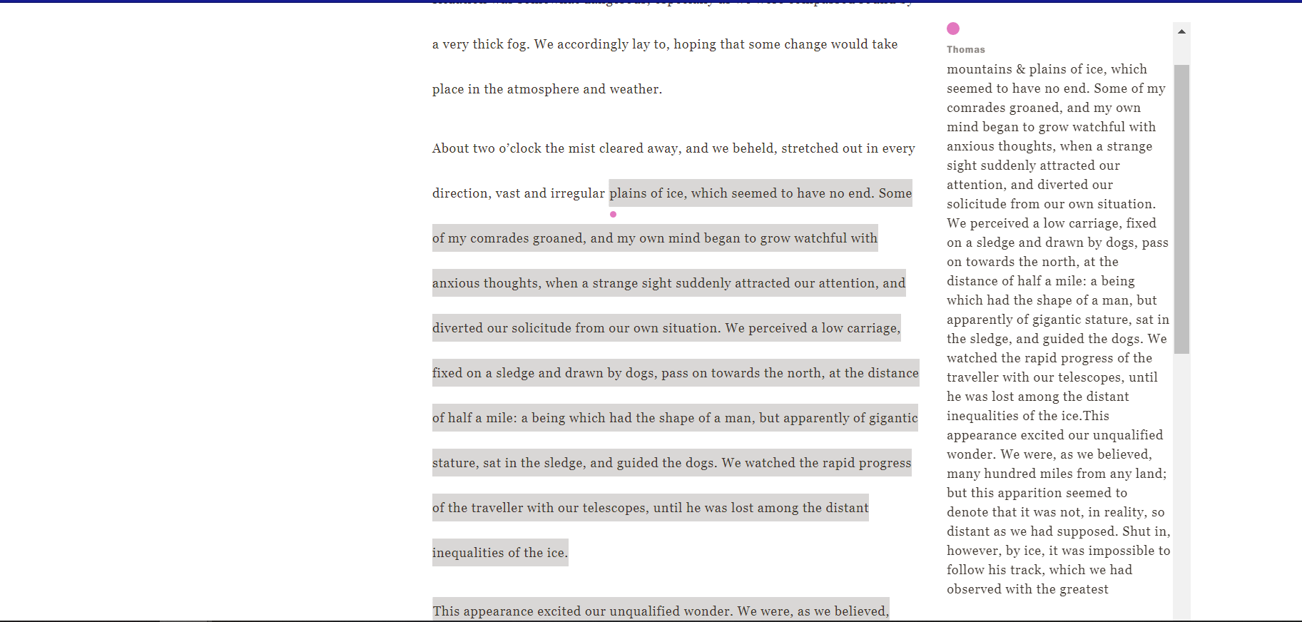
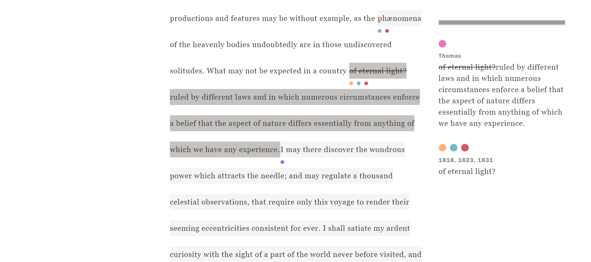
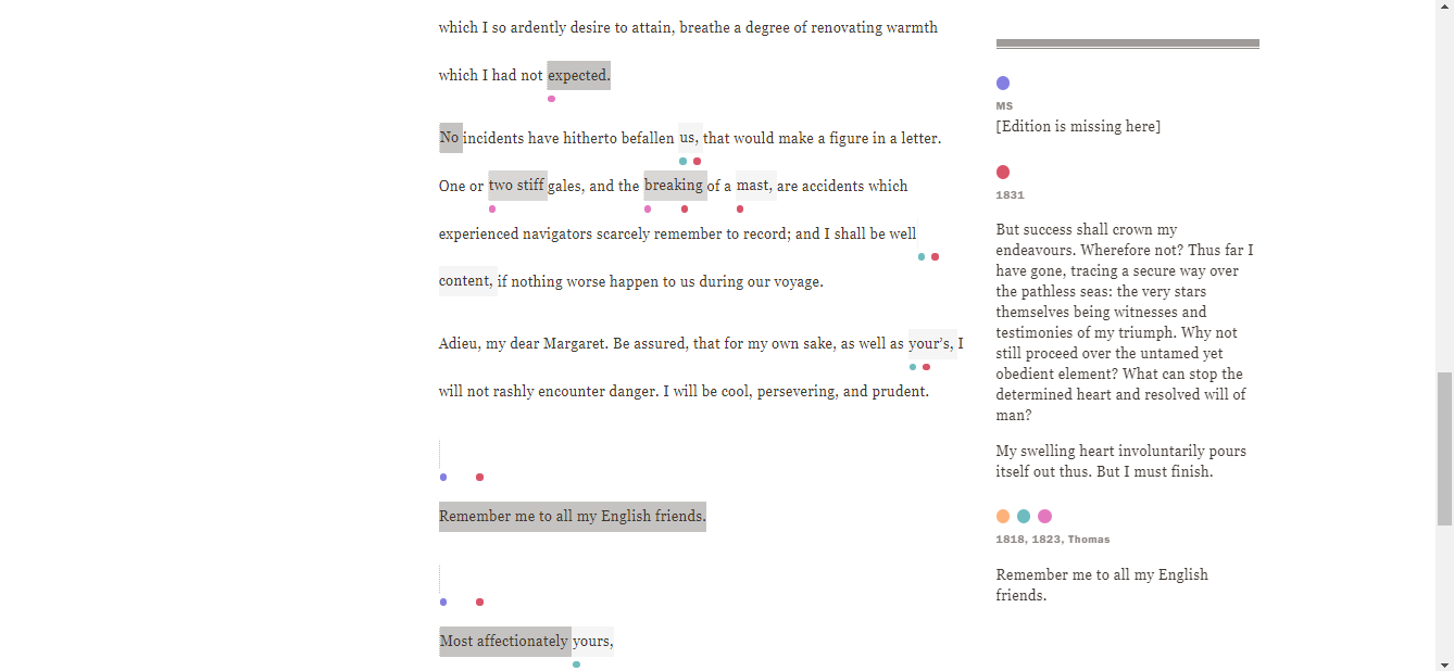
As I read through Frankenstein, I noticed several differences within the Thomas edition. This understandable, given the history behind it, but there are numerous changes that separate this edition from the others. An example of this (pictured below) is from the 1818 edition, section 5. Two paragraphs are written in greater detail, but they ran on and were difficult for me to follow along with.
Frankenstein: 1831 Edition
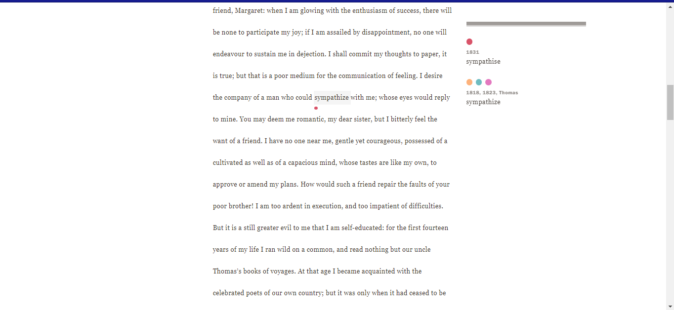
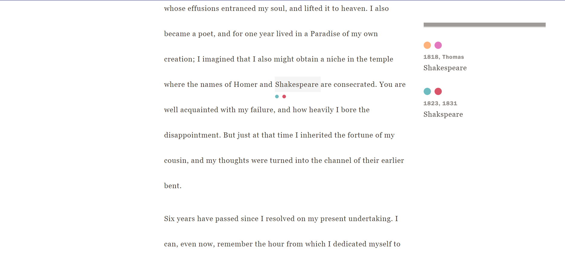
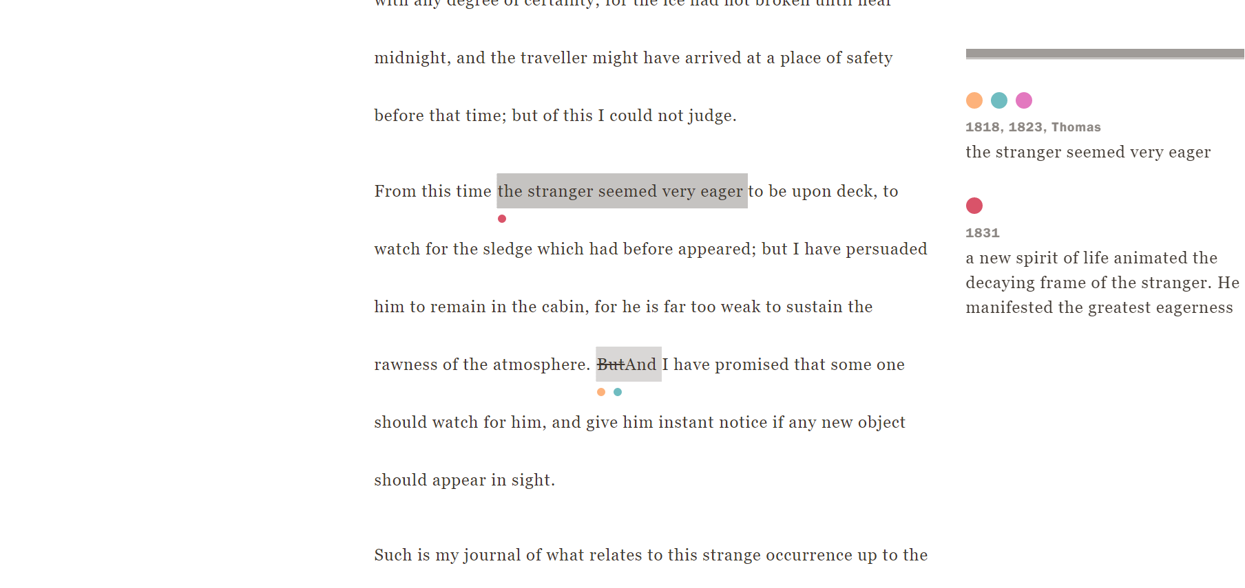
Similar to the Thomas edition, the 1831 edition makes several changes. The 1831 makes smaller changes in spelling, grammar, and punctuation, with some inconsistencies. Section 3 of the 1818 edition includes the modern spellings for sympathize and Shapespeare (pictured below), while the 1831 version spells it differently.
The 1831 edition isn’t exempt from large changes. Several instances, such as section 4 and 5 of the 1818 version, wrote the scenes to be longer. The scenes are comparible to the Thomas edition in length, but interestingly, very few changes from the Thomas edition carry over to the 1831 edition. It emphasizes the differences between the two, and the similarities between the previous editions.
Finishing Thoughts and Critiques
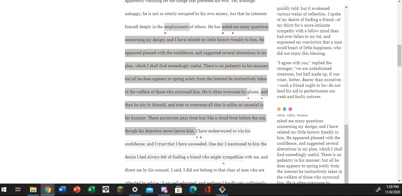
Before concluding my reflection, I want to provide a critique of the Variorum Viewer. The website runs well and I haven’t had issues with the pages failing to load or crashing, but I’ve had issues with what I call “The black bar”. I’m not sure if this is exclusive to Windows, but when I am reading through a comparison that takes up a lot of space, the text will wrap to fit the box. Unfortunately, this results in the last line of text being cut, with the characters being hard to read. I’ve tried zooming out on the web page, which fixes the problem slightly, but not enough. I hope this can be fixed. I’ve provided a picture below.
Another critique I have for the viewer is that the text box on the right shows the differences, but I feel like the icons for each edition can be clicked on, opening a new tab to the respective version so the viewer can see the context for the passage before each change.
I have one more suggestion, but it is minor; the viewer runs quickly, which I commend it for, but I feel like an indicator fading onscreen saying “section loaded” or “edition loaded” would be helpful. If the reader has a task such as a Zoom breakout group or is multitasking with the reading, the indicator cue the reader in when it has loaded, fading out once the page begins scrolling.
I have not used the mobile version of Variorum, so I cannot report any problems there. I hope my feedback was helpful, and I enjoyed working on this project.