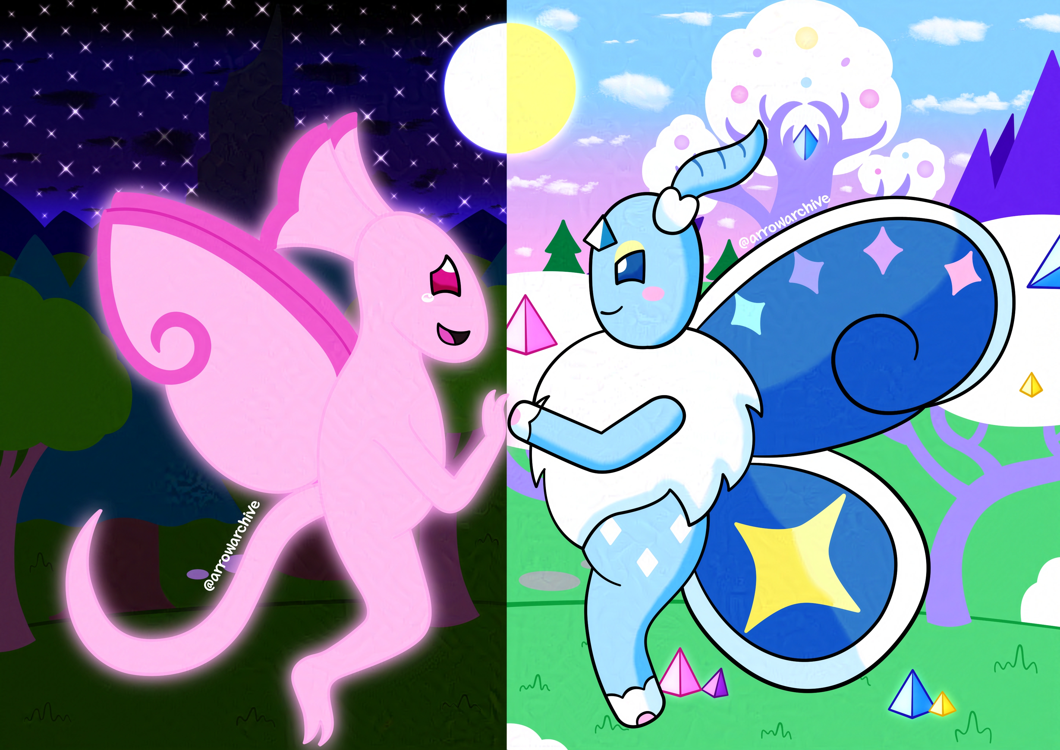
Successor

This piece wasn't an immediate priority of mine; originally, I was planning on drawing images for my website's FAQ or TOS, character sheets for Pyro and Shadow, a Halloween image for this year. Hell, I even considered making a new Bluesky banner before I settled on this, but something inside me pushed me away from my bigger projects, from ideas I needed to complete instead of ones I wanted to complete... and no, it wasn't anticipation for a new art setup, that will come later. It wasn't until I scrolled through my gallery that I realized what was pushing me away from those projects was burnout; sure, I love how the new page images turned out, but each of them took over a month from start to finish, so I wasn't ready to dive headfirst into a third one without giving myself a break. That usually meant drafting up a new character sheet, but I was drawing blanks when coming up with ideas for who to draw and what to write about them. For those reasons, I chose to do something different; by taking a detour, I gave myself the freedom to draw something I wanted to draw rather than what I expected myself to draw. This was my breather piece, so with how chaotic life was at the time, I needed this.
As I was finishing my previous piece, I found myself daydreaming about Prismoth, a toy-sized character that made her debut in Chillin' Vibes. She reminded me of a character I designed seven years ago, a forest fairy named Star, who lingered in my mind years after her story was forgotten and her world faded away. I remembered wanting to transplant her into Nimbus's world, but wanting to redesign her first. When she finally received a redesign, she received a new name to accompany her new body with no acknowledgement of her past self.
The differences between Star and Prismoth are night and day, so I incorporated a duality motif not dissimilar to 2020's Mayday. The backgrounds for each side serve not only as a metaphor for how different their designs are, but for how much my style has evolved over the course of seven years; between 2016 and 2018, my backgrounds were simple, if I drew them at all, with my knowledge of depth and perspective leaving much to be desired. It was an era of muted palettes, where my unnaturally colorful characters clashed with their earthy environments. This is a stark contrast to current style, where I've embraced bright color palettes and made them a cornerstone of my branding. I've found ways to incorporate brightly colored characters into brightly colored environments without them clashing and I've become more ambitious with my backgrounds, even if I'm not perfect at them. Just compare the bonsai-style trees on Prismoth's side to the cartoony oak and pine trees on Star's side, it's clear that making the worlds more dynamic is paying off, and I'm proud of it.
Prismoth wasn't too difficult to draw, as I had references from her previous to work with and I've had ideas for how Nimbus's world would look long before I started the piece. Star, however, was a different story; unlike Prismoth, all the drawings I made for her were traditional, and over the course of seven years, those sketches were lost to time. This forced me to draw her from memory, which wasn't too hard due to the simplicity of her design. The biggest difference between her appearance now and how I drew her back then are that her fins were straighter and significantly thinner, but otherwise, she's exactly how I remember her here. Drawing her digitally also meant that I could do things I couldn't do before, like having a faint glow emanate from her body. I was so excited about this that I incorporated it before I even finished sketching her background!
The only other notes I have about this piece before wrapping up are some things I could have done better; the black mass in Star's background is meant to be a stone spire, but the colors I chose for it when combined with the darkness of the night sky made it appear much darker than I intended it to be. One of Prismoth's paw pads is pink rather than black, which was an oversight, but it's not worth fussing over. If the oversight was blatant enough to warrant redrawing entire sections of the piece, I'd be more concerned, but here, I don't mind. I also planned on adding text saying "thank you for preceding/succeeding me", but I couldn't find space to fit it in after finishing the sky, and by that point, I felt it was unnecessary to include it, so I left it on the cutting room floor.
This was much shorter than my previous entries, wasn't it? I can't guarantee that all entries will stay this length, especially since I love rambling about details, but for this one, I felt as if there was more to show than there was to tell. I haven't decided what my next piece will be, but I've started sketching something small for an upcoming art share I plan to host over on Bluesky. I won't post that drawing here, as it's solely for that occasion and I won't have enough to say about it to warrant its own entry. For now, thank you for reading, and I hope you'll look forward to my next piece!