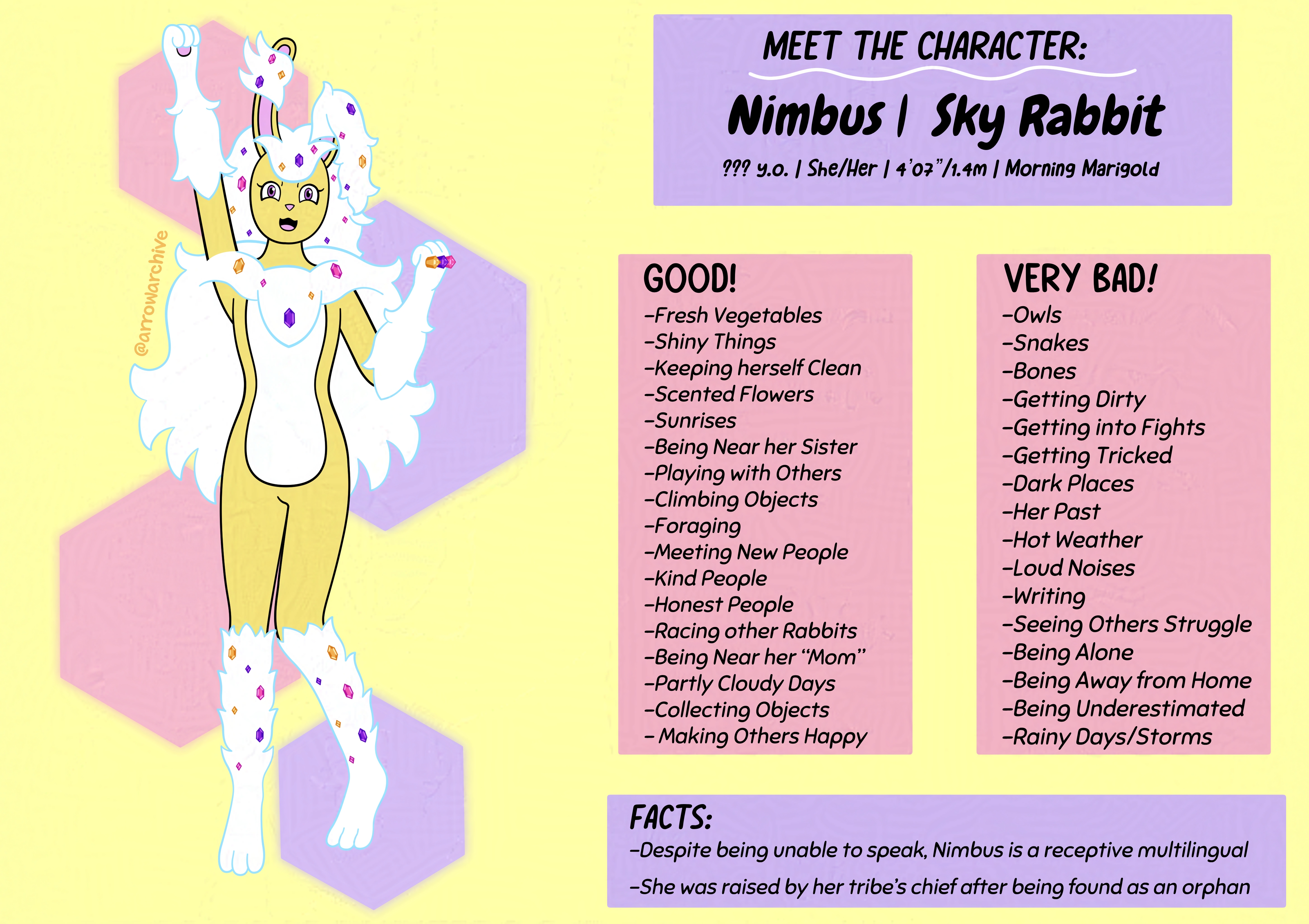
Meet Nimbus

Two months after Aqua's character profile, I make one for Nimbus. If you've been following the history of my gallery, then you may sense a pattern here...
…And no, it’s not the proximity of their release dates. That was a coincidence. If you’ve been following The Arrowarchive for a while, you’ll know that Aqua and Nimbus were the original mascots of my website when it first launched; They still are the mascots of my portfolio, but Lylatt and Cithera joined the mix as of July 2021 due to their unexpected popularity and because they were incredibly fun to draw. In fact, to cement their status as the archive’s mascots, I drew an image with Aqua and Nimbus together that served as the website’s front-page image… before swapping it out after less than five months. You can view that piece here.
When designing Nimbus’s character sheet, my goal was to keep the layout of her sheet like Aqua’s yet make it different enough to stand out. That’s when it hit me: the background for Aqua’s sheet is decorated with stars, so why not decorate Nimbus’s sheet with something I associate with her? After pondering for a bit, I settled on a hexagonal crystal background for her. For me, it was this or diamond crystals, which I associated less with Nimbus and more with Mayonaka. The best part of this decision is that it will make designing Mayonaka’s character sheet easier in the future./p>
I had two goals in mind when designing Aqua's character sheet: first and foremost was designing a layout that I could use consistently for more characters that doesn't distract from the characters themselves. My second goal was to strike a balance between showing enough of her personality to reel people in and keep them invested in her while avoiding revealing so much about her that people would lose interest in her or risk cluttering the character sheet. These may seem like easy goals, but they were more difficult than I expected because there was so much I wanted to say but couldn't without risking the structure of the piece.
I wanted to model the colors of Nimbus’s character sheet after the primary colors in her design (purple, yellow, white, and pink), but I had trouble finding colors that didn’t overshadow Nimbus herself. After a bit of tinkering, however, I was able to find shades of purple and pink that mashed well with her color palette, and while I did find a good shade of yellow, it took longer for me to find than the other two. Additionally, I wanted to see if I could make some of the text boxes white, but I wasn’t able to make it work. White font didn’t look great either, so I chose to scratch that idea. Her sheet was fine with the colors I chose, so I didn’t need to force myself to include more.
Another notable difference between Nimbus’s sheet and Aqua’s is that Aqua’s has a white outline around her design. I tried giving Nimbus a white outline around her, but she couldn’t pull it off very well… or that’s what I would’ve said if I didn’t forget about it until writing this commentary. After realizing this, I revisited the piece and tried giving her an outline, but I wasn’t a fan of how she looked with it, so I scratched that and moved forward. One detail I did correct, however, was the formatting of the “good vs bad” lettering. In Aqua’s sheet, one of the columns had the header italicized and I didn’t realize it. I swiftly corrected that here and made sure that the same error won’t repeat itself elsewhere. It’s one of those things you only notice after you’ve finished the piece… or unless you have a good eye.
Once the sheet’s layout was done, my focus shifted to Nimbus herself. I wanted to focus on the cute and cheerful side of her in her design, so I gave her an excitable pose and somewhat of a cat smile. I also fine-tuned the design of her cape and officially gave her black pupils after initially giving her white pupils during 2021. Her legs took a while to get right, but her hands- er, paws, took the longest to draw. It’s because her left paw shows her knuckle crystals at an angle, so getting the perspective right took a while. I also had to cross-reference my previous drawings of Nimbus to see which drawing for those crystals because I wanted the pink and yellow crystals to be positioned correctly. I would’ve been frustrated at myself after finishing the piece if I ended up getting the crystals wrong.
The last part of the piece I worked on was the hardest outside of Nimbus’s illustration, and that was determining her likes and dislikes. Since Nimbus and her world lack the human-like characteristics of my other characters, she was harder for me to write about. I ultimately made her energetic, kindhearted, fun-loving, and a bit of a neat freak, but gave hints of a traumatic past in her dislikes. Her adoptive mother and sister are characters I plan to draw in the future.
With the character sheets for two mascots down, there’s only two to go. Now I must decide if I want to continue the character sheets or take a break and work on a new piece. Only time will tell.