Trivia Vibes

My website has changed a lot, especially over the past six months. I’d been snowballing ideas since last year, culminating in a new front page image and about image, but the first dominoes weren’t placed until I redesigned my banner and profile picture at the end of January. They've ushered in changes that took place practically overnight, but they’re not what I’m here to talk about. Let’s move onto the subject at hand.
If you compare the gap between the new front page image and the new about image to the gap between my new profile picture/banner and this piece, the former has a gap of just over two months whereas the latter has a gap of almost six months. Long story short, this piece has been in the works for months; I laid the foundation for this piece slightly before I started working on Miss Me, only to shift gears after hitting a stumbling block. When that piece was finished and I was at a loss for what to do next, I revisited this piece with the resolve to power through the hurdles that held me back.
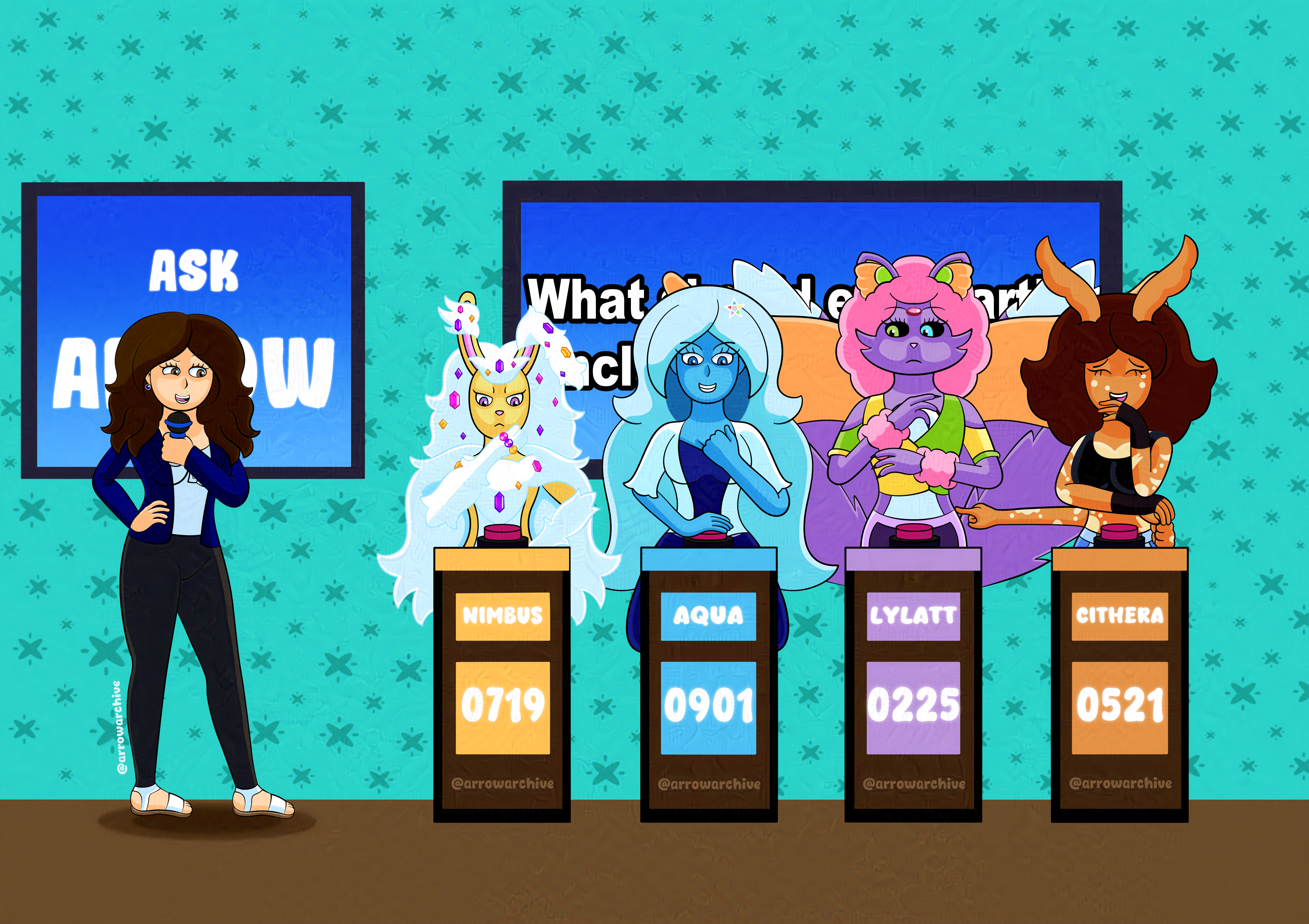
When I started this piece, the idea to theme a Frequently Asked Questions (FAQ) page after a game show was too good to pass up. I had a large pool of references at my disposal, from podium designs and traveling game shows you’d see at parties or school events to stages of televised game shows such as Jeopardy, Family Feud, and The Price is Right. With all the references I had, I didn’t know why I was struggling to make it work; as it turns out, what I needed was to view it from a different angle. I’m not an expert when it comes to perspective, but I was determined to make my stage look as authentic as possible, even if it meant drawing the characters and podiums at an angle. This was easily the biggest stumbling block I encountered, but once I viewed things from a different angle, I shoved layers for my original floor plan in a folder and quickly forgot about them.
Once the podiums were facing the camera, drawing the characters was easy. I knew early on how I wanted them to look and I sketched them quickly since the podiums concealed the lower halves of their bodies… well, everyone but me, but I’ll discuss that later. Aqua was the quickest character to sketch while Lylatt took the longest, line art went pretty smoothly, and I went for an overhead shading effect that looks better on some characters than others. Additionally, I wanted to cut back the amount of erasing I’d have to do during the line art and coloring stages, so I used layer masks for the podiums and each character. It took a while to figure out, but it paid off in the end, as this piece would’ve been much more frustrating without it.
Before I continue with behind-the-scenes stuff, I want to explain two big reasons why this took so long: real life stuff and burnout. In addition to drawing and managing my website, I built a new PC with help from a friend, started teaching myself 3D modeling, and I’m preparing to learn new skills/software in my field. I’ve been doing all this while working part-time, so time hasn’t been on my side and my time management needs improvement. I’m determined to accomplish my goals as an artist, but I’m not willing to risk my health for it. I’ll take things one step at a time to get to where I want to be.
Getting back on track, The podiums took a while to get right, but I’m happy with how they turned out. I had to play with Clip Studio’s alignment tools to get things right, but I sorted things out. I found a way to show the highlights on Cithera’s shirt and paint over the lines (that I’ll need to bookmark later), I used a new shading approach for Nimbus’s gems that turned out better than expected, and this piece transitioned from my iPad to my new PC without any issues. Yes, this piece marks the end of one era and the beginning of another.
Once my new PC was built, I installed Clip Studio and used the cloud to transfer this piece and a few others to my new setup. I had to reinstall some fonts, a handful of brushes that were removed from older versions, and find where cloud files were being stored, but otherwise the transition was seamless. Almost everything here was drawn on my iPad except for my caricature, the wallpaper, and about 25% of the shading. The differences are subtle, all things considered, but they’re noticeable if you look hard enough.
To wrap this up, I’ll share some small details; the microphone I’m using is the same one that’s on the bookshelf in Chillin’ Vibes, My caricature’s outfit is modeled after my own wardrobe (again), and the numbers on everyone’s scoreboards align with completion dates for their art. Which ones? I’ll leave that for you to discover. For now, I’ll be working on smaller art projects and adjusting the code for the website. I’m also planning on rewriting my FAQ and TOS, but I’ll cross that bridge when I come to it. I’d rather not rush into things.