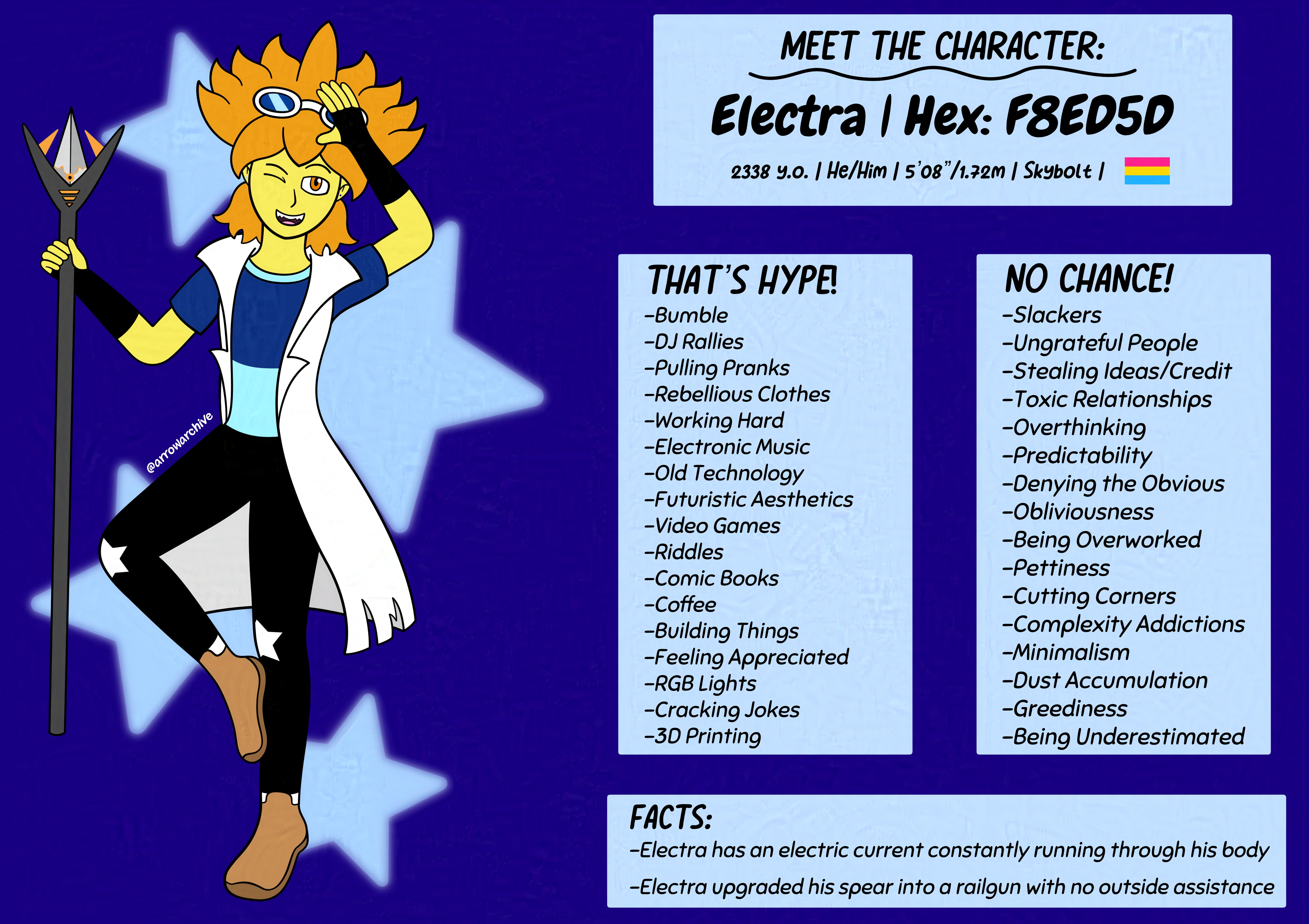
Meet Electra

I've been wanting to redesign Electra for almost a year, and I'm SO happy with how he turned out here. Now, if you're reading this and asking yourself "Arrow, why are you talking about Electra like you've drawn him recently when you last drew him in 2021?" Then no, you're not crazy; I tried redesigning Electra last August, but I immediately hated it and the only place I posted it was on Tumblr before I deleted that account and any art on it. If it weren't for this piece, that design would've stayed in the abyss, but since Electra's redesign here is so heavily influenced by it, I dug up his old look and immortalized it here, with a reflection of which ideas stuck and which ones died faster than my CoHost account.
In my eyes, Electra's most recognizable feature is his hair. It's the source of his electricity and makes him look taller than he really is. When styling his hair this year, all eyes were on Stardew Valley, as Sam, one of the game's bachelors, had a perfectly spiky hairstyle that wasn't too outlandish for me to draw. I managed to balance his bangs with the style's spikes, and despite how vertical his hair is, it still manages to go past his ears. That is a part of his hairstyle that hasn't gone away, and I'm glad it has stayed, and eagle-eyed viewers may notice that Electra's hair is a brighter shade of orange than it was before.
Despite considering last year's design a flop, some ideas were so good that I had to reuse them. His white goggles, fingerless gloves, and ear piercings are here to stay, his upper teeth have two fangs on each side when he's feeling playful, but there were some changes I had to make. The sleeves of his labcoat have been removed and he's wearing a new shirt design. I retired his electric star shirt after four years because for as intriguing as it was, it was irritating to draw. It was especially bad whenever he wore his lab coat, as it meant wasting effort on a design that was obscured by extra layers. Safe to say, I was eager to replace it after I stumbled upon dual-color shirt patterns while researching. Not only is it simpler to draw, but it allowed me to incorporate brighter colors into his outfit, something I've been wanting to do for a while.
Removing the star from his shirt made me wonder where I'd put it instead. My original plan was to have it embroidered onto the back of his lab coat or as buttons on his lapel, but then a lightbulb went off as I though "what if I make the stars part of his leggings? I could have them be cutouts on his knees that would have white fabric underneath as to avoid exposing his skin." It was a natural fit, especially since the majority of his previous designs had additional fabric wrapped around the knees. It was an unintentional call-back to his previous appearances, and I was more than happy with how it turned out here. Some ideas never fully fade away, and this was an example of that.
Other small changed I made included making his brown shoes sneaker-sized rather than boot-sized and having his socks visible just beneath the leggings. Otherwise, his redesign applies some of the good ideas from last year, getting rid of the bad ones, and applying what I've learned in the past year to his current appearance. He's much more expressive, there's more flow to his jacket, and overall, he has a lot more life in him than he did before. He's as mischievous of a friend as he is a dedicated worker, doing whatever he can to keep himself focused and playing games when he's not. He has a lot of character, and I'm glad I can show more facets of him.
If I can see myself changing one thing about this piece, it's his spear. The design looked good as a sketch, but colored in, I feel that there's room for improvement. It's been four years, so it makes sense why that design wouldn't stick. Much like Electra's own design history, it's gonna take a lot of tries before I get it right, and I'm content with that.