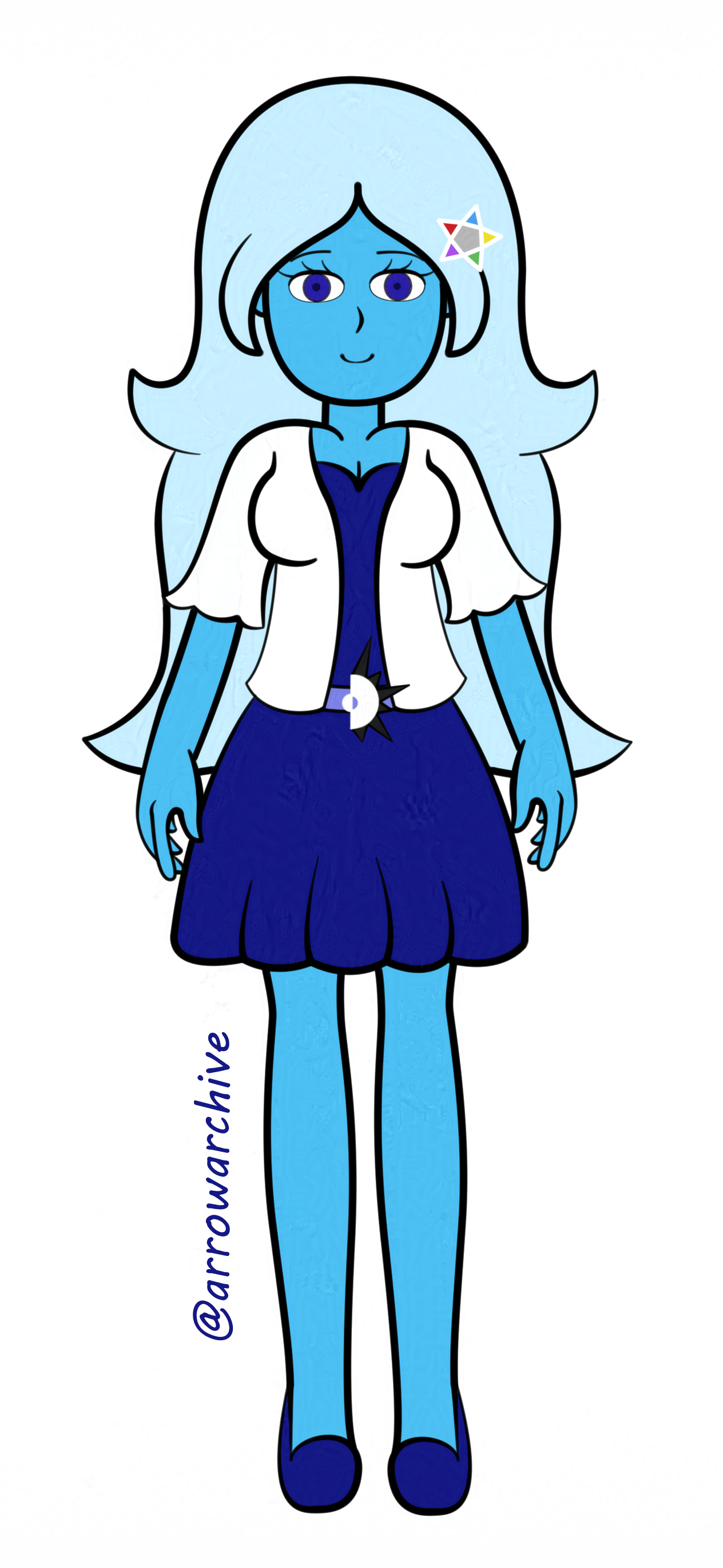
Aqua's Redesign 2: Electric Boogaloo

My entry from April 8th was only the beginning of Aqua's redesign; the changes I made there carried over here and stuck around ever since... for the most part. Several aspects of Aqua's design were altered or dropped, but a lot of details went unchanged over two weeks. One detail that went unchanges was Aqua's dress; same color, same belt size, and a similar neck line, with the only difference being that her cardigan covers more of her chest. Much like the other piece, Aqua's eyes are the same color as her hair and shoes, her belt is thin, and her cardigan is the same shape. What's worth discussing are the differences between Aqua's redesigns, which changes were made, which changes were carried over, and how they stack up in comparison to Aqua's modern design.
This design is the closest to Aqua's modern design it gets before actually reaching her modern design. The hair follicles in front of her ears are gone; instead, her bangs are longer and cover her ears, which this piece shows well and other pieces allude to. Her hair is also fluffier, similar to her 2019 incarnation, but it retains the previous drawing's curled tips and accentuating them at the cost of shortening its length, with her hair stopping at her waist rather than passing it. This is a detail Aqua's modern iteration retains this detail, showing up in every piece she's in unless her hair is styled up. The star pin, which was absent in the April 8th piece, now reappears as a hair pin by her left ear. Aqua's eye design is closer to her modern incarnation than the previous piece, and her feet are more prominent. All of the details I've mentioned here evolve with Aqua, but a few had to be changed or cut for various reasons... mostly serendipity.
Some changes were made for Aqua's design prior to her modern incarnation, and while this drawing was where most of them started, there is an elephant in the room that I must address: The Eclipse emblem, which was absent the last time I drew her, has returned without explanation. I had no intention to keep the emblem as part of her design, but I believe that I may have included it as a reference when evaluating her dress's color palette. After this piece, the emblem hasn't appeared since, and I plan to use it in later artwork, but as a set piece rather than an accessory. I also decided that having Aqua's eye color match her dress made her pupils hard to see, so I made her eyes a lighter shade of blue in the Pinterest study less than two weeks later. Outside of that, changes for Aqua's modern design have been minor, with this piece and the one before it laying the foundation for the Aqua I draw today.
She was the second character I redesigned, with Shadow being the first, but Aqua's changes were experiments that stuck whereas Shadow's were done out of necessity. I wanted to see if the ideas I had for Aqua worked as good on paper as they did in my head, and most of them held up. I had more ideas for Aqua that needed fine-tuning compared to ideas that needed to be scrapped, so it's a sign of how far she's come when I can comfortably say how happy I am with her development over the years. Look at this piece and the one before this than look at her before and compare both of them to how she looks now: that's art evolution at its finest.